
Capital letters, what’s wrong with capital letters?
This is part of my pages on Typeface or Font Readability.
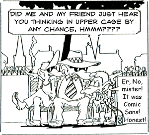
illustration by Geoff Adams
Some people, who know all about these things, say that sentences entirely in capital letters are what you don’t do; they’re supposed to be hard to read.
That may be right sometimes, but not always. Have you ever seen a comic book? Hard to read? Surely not. (Comics are traditionally done with upper case in the speech bubbles.) The use of upper case in comic strips is not so universal as it once was, but looking at the cartoon picture you can see the sense of it. Here I’ve used Comic Sans to look rather weak and pathetic and it works quite well in that way. The gangster’s
speech bubble is in a traditional, strong, comic book face, and if I hadn’t told you that, I’ll bet you wouldn’t have batted an eyelid. I find the all-upper much easier on the eye, though again I must stress, in this circumstance.
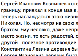
The other thing to consider, when someone says to you with such absolute confidence that passages written in all upper case are nigh-on unreadable by young people, is whether 140 million-odd Russians can be wrong. For while Cyrillic script does have a lower case, it’s conventionally written in books looking much like what we who are used to Western typefaces would call small-caps – from a readability point of view the lower looks quite like the upper, as in the example.
(Click here and some text should appear giving more details about this.)
The example shows Russian lower case letters, consider especially the ‘e’ and the ‘a’
Some characters do not exist in an uppercase variant in the Cyrillic alphabet.
Refer to line 3, word 1, last character: it is a so-called
‘soft sign’ (мягкий знак), which only
exists as lowercase in the common alphabet. This is comparable to the German ß, although there
is an uppercase variant for it now.
my thanks to Tobias Pape for furnishing this information
Do Russian children find it harder to learn to read than do Western European, Australian or American children? I dunno, ask your teacher. (There’s a technical discussion about Cyrillic lower case at http://www.typophile.com/node/16550).
The idea that passages in all upper case are harder to read than those predominantly in lower
probably stems from the observation that passages in all upper can be slower to read
than those in all upper. Slower is not the same as harder, as slower is only an issue where speed of reading is
of significance, and will be of no or minimal significance in very short passages such as you find in a comic strip.
For the references to experiments that show that lowercase text is read faster than upper, see
The Science of Word Recognition
from Microsoft Typography, under the sub-heading ‘Model #1: Word Shape’.
However, I also quote from that same paper,
sub-heading ‘Evidence for Word Shape Revisited’:
‘The weakest evidence in support of word shape is that lowercase text is read faster than uppercase text.
This is entirely a practice effect. Most readers spend the bulk of their time reading lowercase text and are therefore more
proficient at it. When readers are forced to read large quantities of uppercase text, their reading speed will
eventually increase to the rate of lowercase text. Even text oriented as if you were seeing it in a mirror will
quickly increase in reading speed with practice (Kohlers & Perkins, 1975).’ (The Science of Word Recognition
by Kevin Larson.)
So it does seem fair to say that those who categorically announce that all upper-case sentences are unacceptable in normal everyday human existence are categorically talking out of their backsides. You can tell them that when you next get an opportunity.
Next page in this set: The Bigger the Type . . .
.


0 comments:
Post a Comment